
For 16 years, Emultimax has been providing advanced heating, air conditioning, and ventilation (HVAC) systems,prioritizing real improvements in client quality of life. Dynamic growth and market evolution meant the brand required an image transformation to fully reflect its expert profile, knowledge, and market maturity.
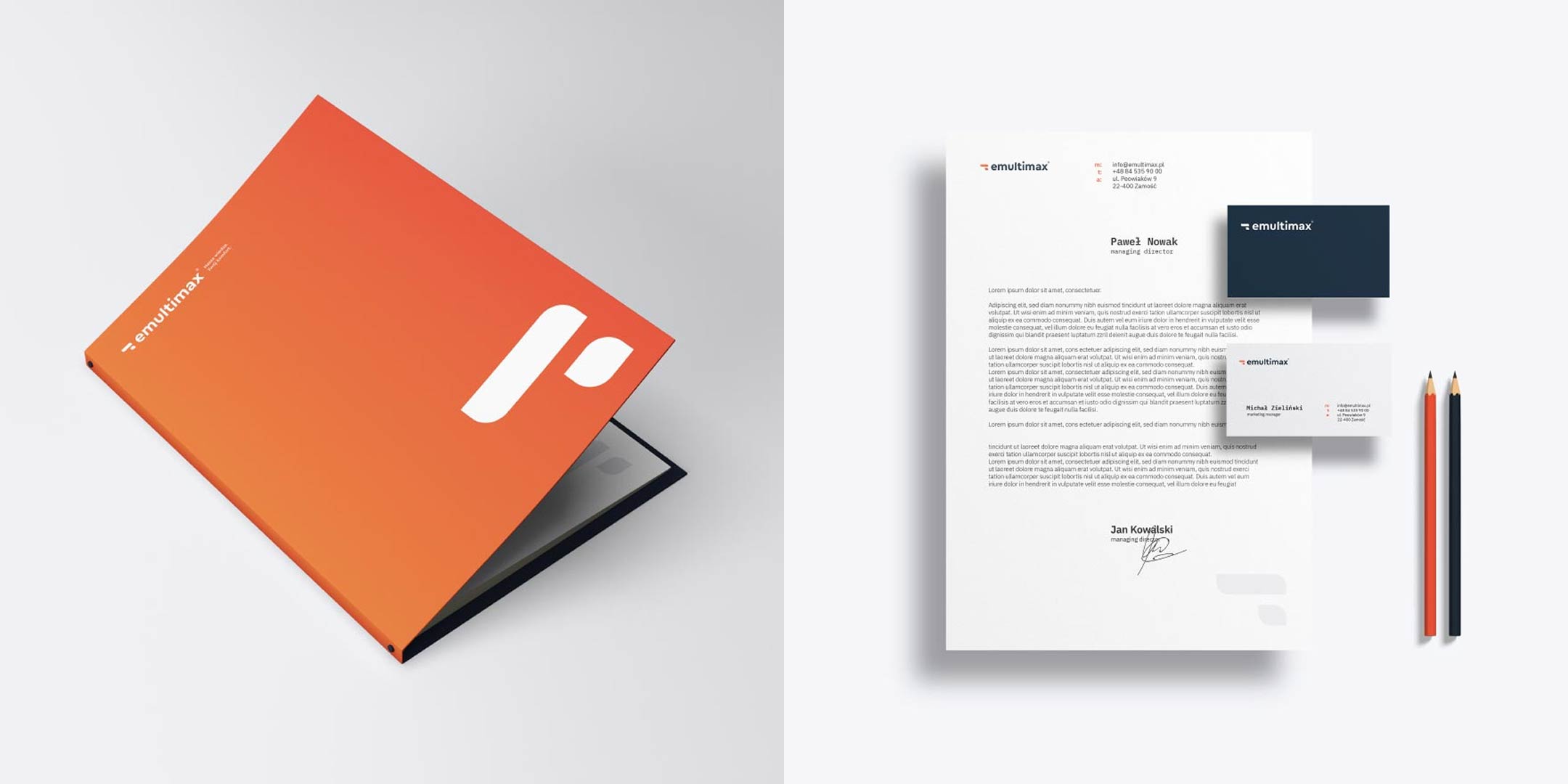
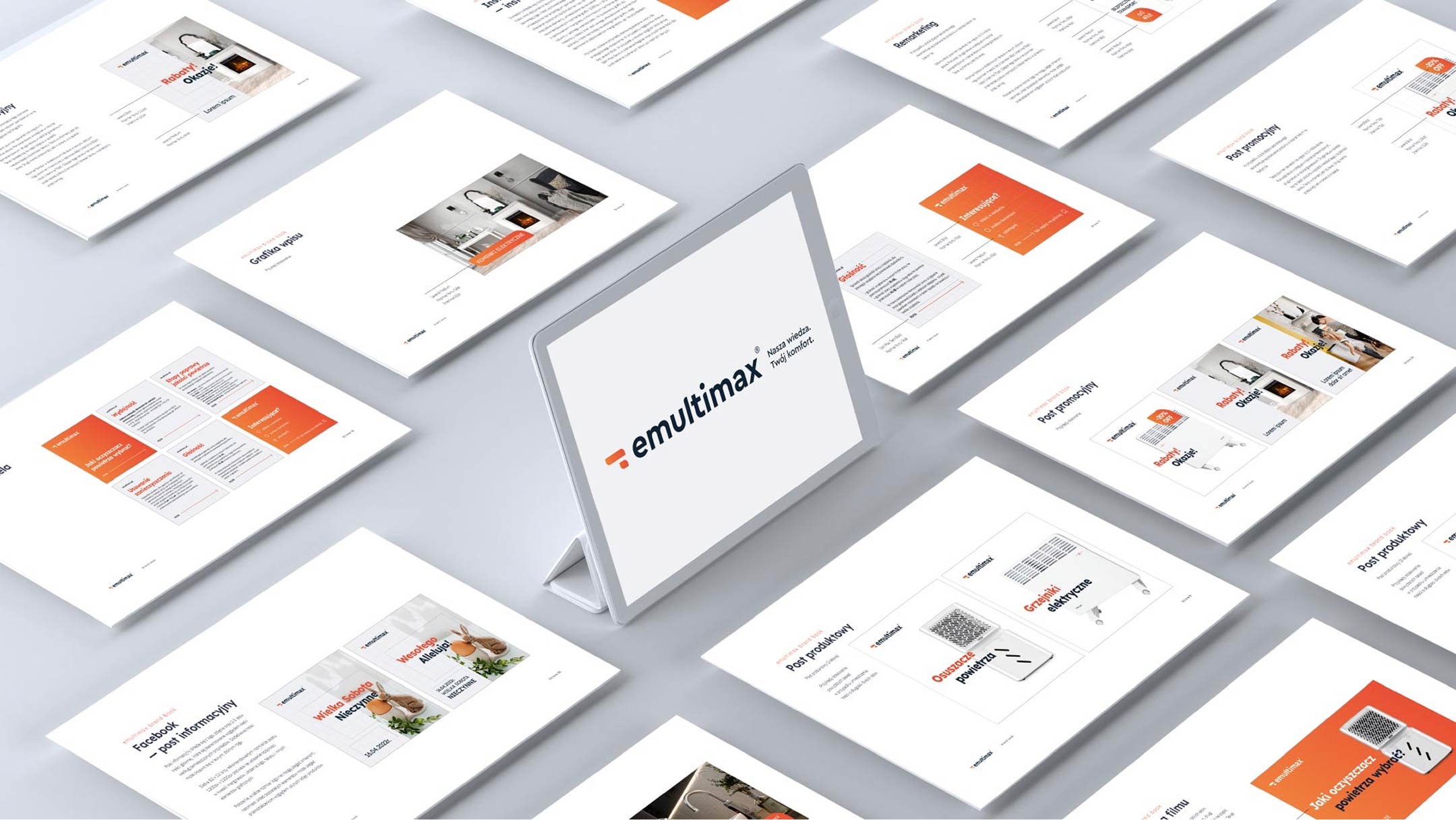
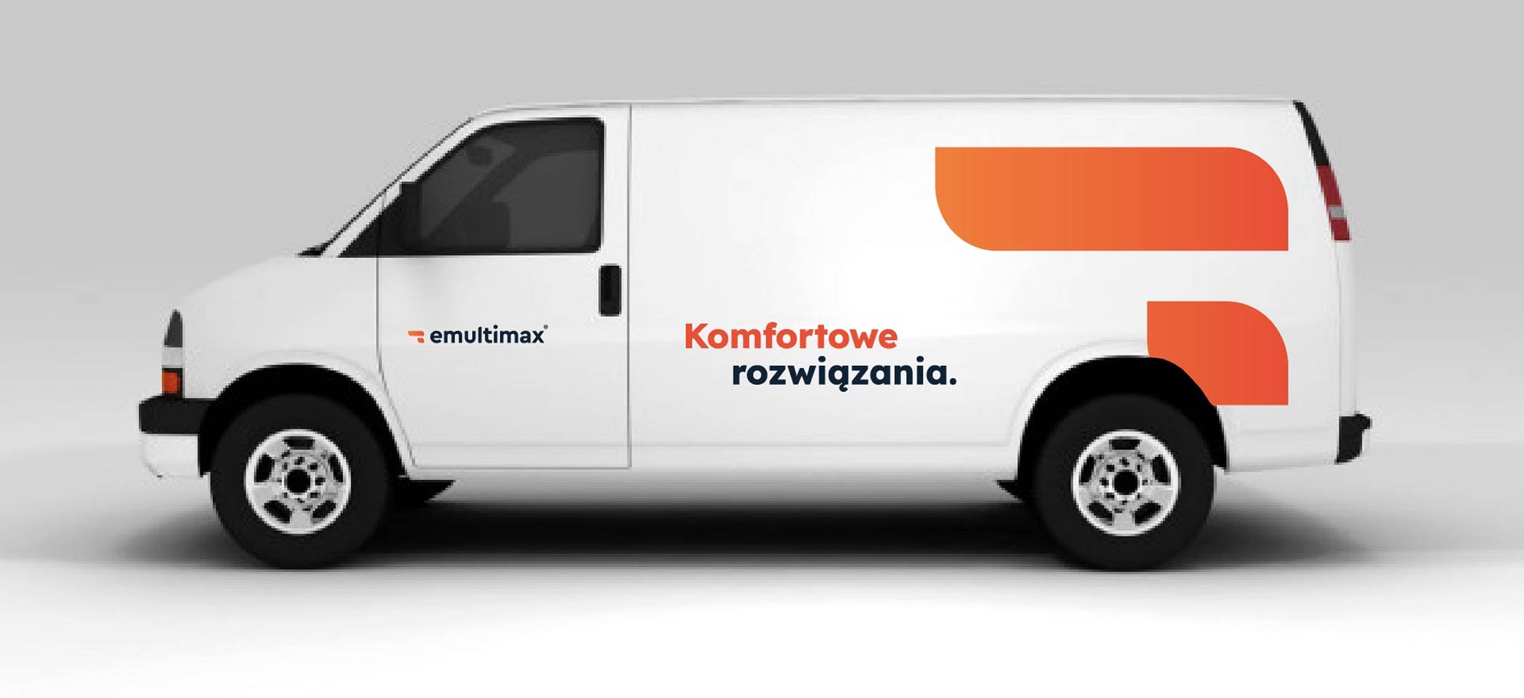
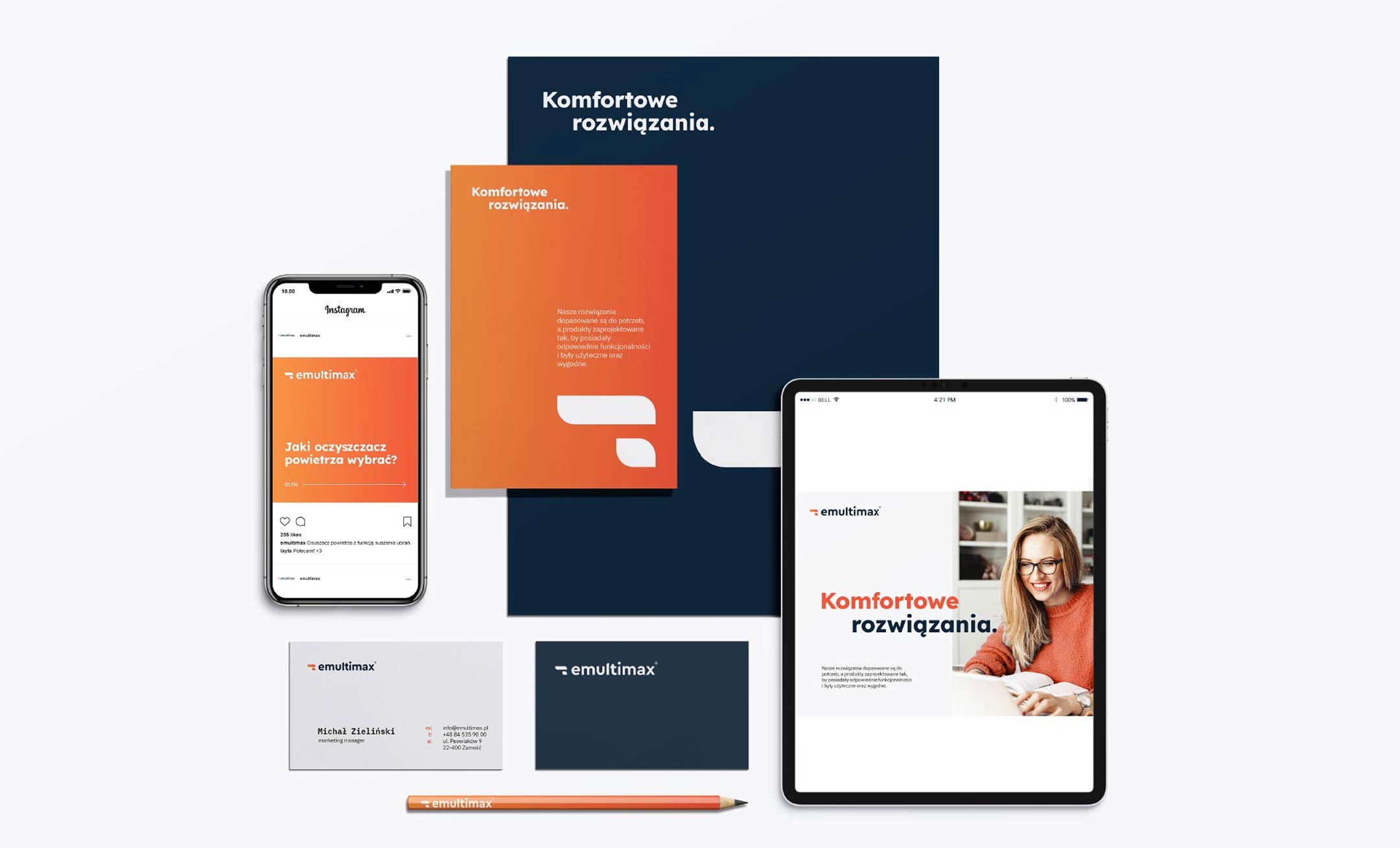
We built Emultimax’s new identity on the synergy of two archetypes: the primary Sage and the supporting Explorer. We utilized geometric typography and a minimalist, abstract brandmark, giving the identity a timeless character. A colour palette based on elegant navy blue (knowledge and trust) combined with energetic orange (modernity) effectively sets the brand apart in the HVAC sector. The implemented system cohesively unifies digital materials, print, and fleet branding.